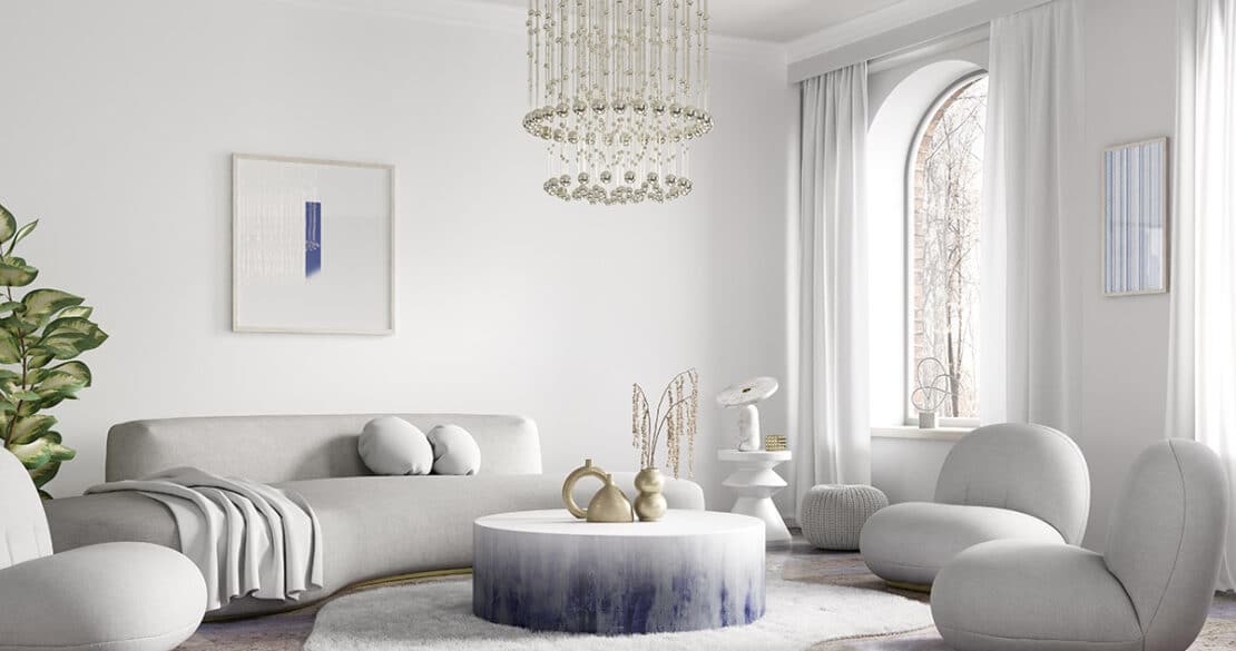
If you’re looking for a more unified, intentional look in your home, creating a color palette that connects each room can make all the difference. Not only does it create an inviting atmosphere between separate rooms connected by closing doors but also allows for better flow in open-plan living spaces and combined entryways. A harmonious relationship between colors gives off the feeling of continuity while still allowing individuality with unique hues throughout different areas of your house.
Unrelated colors in adjoining rooms can create a feeling of disjointed spaces, while hues that complement each other will guide the eye from one room to the next and form visual unity. To craft an entire-house color palette that transitions seamlessly between every area, utilize these helpful tricks!
1. Create Flow with Color
When designing a home with an open floor plan, or one that has wide entryways between rooms, selecting colors for each area is vital for both form and function. To create distinct spaces while maintaining cohesion within the abode, think of small details such as window coverings, fabrics, and wall hangings in similar tones to connect them together. This way you can have personalization from room-to-room without straying away from unity across your house!
2. Use a Thread of Color Between Rooms
For a cohesive look with individual style for each room, use a single hue to act as the common theme that runs throughout. With this trick you can still enjoy lots of varied colors – simply pick one dominant color like white or navy and make sure it appears in every space’s palette. To really bring the rooms together, opt for woodwork unified under the same tone or finish on baseboards, door frames, window frames and ceiling moldings!
To add a sense of harmony to your home, consider confining your color palette to two or three colors. You can then utilize each hue in varying intensities and applications throughout different areas of the house for a range of effects. For instance, if you go with shades of gray, paint your lower kitchen cabinets a dark stormy shade while selecting something lighter for the adjacent living room walls.
3. Define Connected Spaces with Color
Open floor plans allow architects to create the illusion of more space without having to increase square footage. Yet, that doesn’t mean you have to settle for a one-dimensional color palette. Rather, add some personality and depth by utilizing two or three hues in different quantities throughout each area (on walls, furniture pieces, and accents) from room to room!
4. Connect Rooms with Flooring and Rugs
Transform adjoining rooms painted in dramatically different colors into one harmonious space easily and effectively with flooring or area rugs that combine both shades. Installing a patterned runner along the hallway is an excellent way to connect two disparate tones: for instance, fuse a neutral base with bolder colors. Keep in mind; you don’t have to be perfectly spot-on when matching wall and rug hues – slightly darker or lighter hues can still blend together seamlessly!
5. Unify Colors with Trim
To achieve a coherent flow from room to room, paint all of the trim white. From bright and pure whites that contrast crisply with bold colors, to softer shades for harmonious hues – whichever shade you choose will reinforce the effect subliminally and make your guests feel right at home. For best results however, pick wall colours first then find a compatible white that ties it all together!
Other Color Tips for a Cohesive Color Scheme
As you choose colors for each area of your home, remember that illumination alters the appearance of any hue. Let’s say we take a canister of yellow paint and apply it in two distinct rooms—one with limited natural light while the other is sun-kissed throughout the day; they will seem like different hues entirely!
To give your home a sense of coherence and yet still have each room feel subtly distinct, take advantage of this approach. Pick two hues that are close in relation (like adjacent shades from the same paint strip) and apply the paler one to the sunniest area; it will bring light into your room all day long! This technique works especially well with L-shaped rooms wherein one side serves as living space while the other is designated for dining.


